Web design is constantly evolving. Every year new trends are born. Some stick around for the long haul and others fade quickly. It’s just how the design world works.
But it’s all of these things together—the genius design trends that stick and the ones that suck and fade—that make up the face of the internet as we know it. It’s no big secret either that the majority of trends we see every year often come from giant web design companies.
However, good web design is influenced by more than just the big design agencies. Music, fashion, cultural events, news and more also play a big role in the design trends we see.
So the big question going into 2017 is: What are some of the most exciting new web design trends everyone’s anticipating in the new year? We’re glad you asked!
As designers, it’s our job to stay up-to-date on all the cool things happening with graphic and web design so we can create stunning websites for anyone who comes knocking. Let’s check out what to keep an eye on in 2017 so we can keep websites looking fresh all year long.
Visually Interesting Trends You Can Expect in 2017
- Better & Brighter Colors
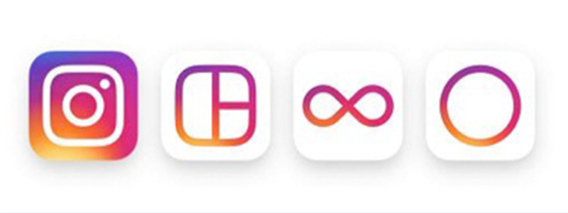
As movements like minimalism grew insanely popular in 2016, web designers had to find creative ways to infuse personality into their designs while working within the stripped-down aesthetics we’ve all come to know and love.And in several cases, bright and bold colors became the solution. While it’s *not technically* a website, look at Instagram’s app icon redesign:
As you can see, it’s not just about bright, bold colors. Gradients are here in a big way and expected to have an impact on websites in 2017 in a big way.
Instagram did a great job blending and blurring those exhilarating hues into something reminiscent of a soft summer sunset. Better and brighter colors are something everyone should be looking forward to in the upcoming year.
- Hand Drawn Iconography
Speaking of icons, hand drawn icons in web design are something else to keep your eye on next year. Hand drawn icons help web designers create websites with contrasting elements that keep users engaged with your site. Epic’s website, for example, embraces a lot of creative things: funny hand-drawn characters, flat-style landscapes, a little grunge and amazing typography.
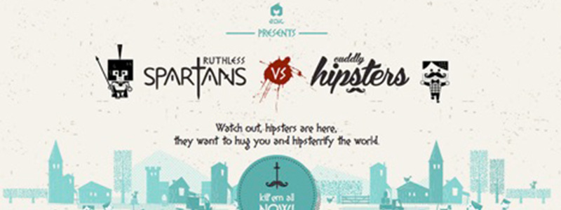
We don’t know how many sites like Epic you’ll see popping up in 2017 but we expect to see a lot more hand drawn elements regardless. We’ve already begun to see a trend towards using hand drawn icons with CTAs in a joint effort between marketers and designers to increase conversion rates.
Think it’s a trend that will stick? Tell us about it in the comments. Moving on to number three on the list…
- GIFs
GIFs in web design are expected to be big in 2017 but let’s get one thing straight first: don’t abuse them or you’ll hurt the UI experience of your website. If you want to try using GIFs (and animations) in your web designs throughout 2017, do it right. You can use GIFs to accent important aspects of your website and bring it to life. When used appropriately, they give an almost sophisticated touch to sites and demonstrate a deep understanding of web design and how it works.

One Design Company makes nice use of subtle animations on the homepage to welcome visitors and make their site stand out from the competition. So remember, when we’re talking about GIFs and animations here, we’re not always referring to the images you find on GIPHY.
- Overlapping Guidelines
Overlapping guidelines really started to catch on with the introduction of Google’s Material Design Guidelines. The trend is popular, effective, and expected to carry over and shine in 2017.
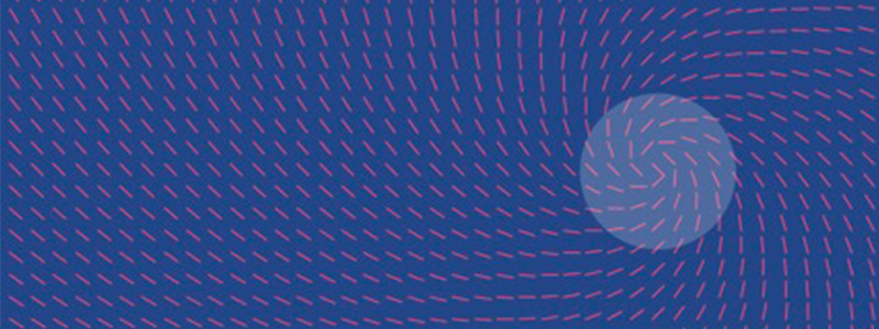
So far, it’s been found to be most effective using contrasting colors and large shadows. This results in a subtle but high impact that produces a satisfying transition between elements as visitors scroll down a page.
- Big, Bold Typography
Yes, big typography has been trending for some time now but web designers like a creative challenge and making big, bold statements. Typography rules used to be very strict but that isn’t the case anymore.The design world has come to an agreement that content deserves our focus and that’s why you’ll be seeing more and more websites feature lines of inspiring copy set in type that’s just as big and bold as the design of the website itself.
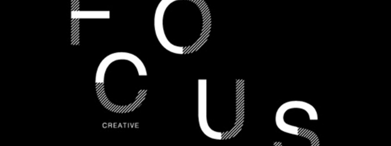
Big and bold doesn’t always have to refer to the weight of a font though. It can also refer to the amount of real estate given to display the copy. In a world that’s as fast and overloaded as ours, concise and powerful statements will become the fuel that good websites run on in 2017.
- Focus on designing for personalization & conversion
Personalization of content has been a hot topic all year long, but no one seems to have the winning answer yet regarding how to do it “right” every time. Essentially, the goal is to provide the right content at the right time to the right person based on things like:-Demographics: Who’s the visitor?
-Behavior: What’s the visitor doing?
-Context: What device is the visitor using and how did they get here? Webflow made an interesting observation earlier this year regarding personalization stating, “We’ve seen some interesting experiments in this direction across the web, many of which revolve around a manual personalization of content recommendations by the user, recommendation of ‘related’ reads, and some algorithmic solutions more akin to what Facebook is capable of doing.”
All you can do is not be afraid to try new things in an effort to find what works best for your business and the people coming to your website. It’s called personalization for a reason.
- Get ready to see more SVGs
Scalable Vector Graphics (SVGs) present web designers with a lot of advantages over traditional image formats like JPGs and PNGs. Instead of being pixel based, SVGs are composed of vectors.Since SVGs are vector based they are resolution-independent and look good on any screen and any device. Plus, you can animate them! So keep that in mind as you move forward in the new year.

Happy Holidays from the Z Coast Media team! Thanks so much for reading the blog. We’ll be taking next week off to recharge and spend time with our families but we’ll be back in 2017 with some exciting new things and brilliant web designs.
See ya then!

 (
(

One Good thing that have come with SEO recently is the new interest for Web standards and the full use of HTML!