Most of the time, before becoming a customer, a person will go through what’s called the marketing funnel (or buyer’s journey). It consists of different stages that flow from people poking around your website to doing something on your website.

Anyone who has a website wants visitors on their website to take certain actions. It’s common to want visitors to sign up for something, fill out a form, or buy a product.

When somebody takes an action you want them to take it’s called a conversion. The visitor converts from just browsing to doing that thing you’re hoping they do. It’s a marketer’s job to give visitors the push they need and inspire them to take that action.

Think about ordering a pizza online somewhere like Dominos.com. There are a few steps, a funnel, that visitors must go through before ordering a pizza. They must:

  • Go to Dominos.com 🍕
  • Start their order
  • Choose the pizza/food item they want to eat
  • Add the pizza/food item to their cart
  • Place the order

There are other steps/actions that hungry pizza lovers can take between each of these mandatory steps, but it makes no difference to the funnel. For example, the customer could add a 2-liter drink to their order, or swap out the pizza for a pasta dish. But it isn’t a mandatory action to complete the order.

Why is it called a marketing funnel/buyer’s journey?

Because your marketing funnel represents the journey your prospective customers take from the moment they find out you exist to the moment they make a transaction with your business.

The marketing funnel consists of five stages:

  • Awareness — This is the stage where people are looking for answers like “who delivers pizza near me?”
  • Consideration — This the stage where people are doing research and comparing their options—Dominos, other pizza chains, local pizza joints.
  • Conversion — This is the stage where people decide to become a customer and purchase a pizza
  • Loyalty — This is the stage where customers are retained by instilling loyalty through things like rewards programs. Sticking with the pizza theme, one way Domino’s does a great job of this is via their “earn points for free pizza” program. It’s simple, it’s effective, and it’s smart. Customers create an account for a speedier checkout and earn points every time they purchase a pizza until they have enough to redeem a free one.
  • Advocacy — This is the stage where customers take to platforms like Twitter and Instagram to tell people how bomb the pizza was they just ate with photos of the food, by tagging the pizza place they ordered from and stuff like that.

Industry, business model, audience, product, and pricing all play a role in the shape that a funnel takes, but all marketing funnels are built on the foundation of these five stages.

To help you understand how the marketing funnel (buyer’s journey) differs between B2B and B2C brands, we’re going to highlight some key points for ya.

The-Difference-Between-a-B2B-and-B2C-Marketing-Funnel

The Difference Between a B2B and B2C Marketing Funnel

  • B2C consumers often take a trip down the marketing funnel by themselves or with a small group of people they trust, such as family or friends
  • B2B consumers set off down the marketing funnel as part of a larger group often made up of multiple people from multiple departments across the business
  • B2C consumers may never interact with a sales rep (especially when we’re talking about ecommerce sites) and that’s totally normal
  • B2B consumers often interact with a sales rep as they approach the lower end of the funnel and that’s totally normal too

The-Multi-Dimensional-Funnel

The Multi-Dimensional Funnel

There’s some debate among marketing professionals about the relevancy of the marketing funnel because the funnel is no longer linear.

Leads come into the funnel at different stages for different reasons. For example, someone might jump straight into the conversion stage and buy a pizza from Domino’s because their best friends advocated for the brand and they trust the referral.

That’s why the term buyer’s journey is so hot when talking about the marketing funnel. It better describes what’s happening as more and more customers take advantage of technology and social media to do their own brand research.

However, when referring to the marketing funnel/buyer’s journey one term does not hold more weight than the other. Both are used by marketer’s and so both are relevant.

The marketing funnel is still a thing. It’s just evolving into a multi-dimensional process that involves less hand-holding and more gentle guidance than before.

What-Makes-A-Funnel-Worth-Anything

What Makes A Funnel Worth Anything?

Data.

Marketing funnel reports will show you exactly where you’re losing customers. Let’s go back to our Domino’s example. This is what we said the funnel looks like for them:

  • Go to Dominos.com
  • Start their order
  • Choose the pizza/food item they want to eat
  • Add the pizza/food item to their cart
  • Place the order

When you add a pizza to the cart, you get a popup to add some breadsticks (or some other side item) and a drink. Do customers have to purchase these suggested add-on items? No.

But it’s a good idea to track how many people abandon their order after this popup and how many people still purchase the pizza they put in their cart. Some people are turned off by pop-ups and some people just don’t pay attention – they may take a quick glance, think they have to spend more money to qualify for the delivery of the pizza they want and just decide to go make a sandwich instead.

Tracking this movement in the funnel tells Domino’s whether to keep the pop-up/how to trigger the pop-up based on the data they gather about whether this pop-up converts or acts as a roadblock for their customers.

There’s always room to improve the funnel and bump up those conversion stats but you must track the data first to make informed decisions that are going to impact the buyer’s journey.

Optimizing-the-Marketing-Funnel

Optimizing the Marketing Funnel

Optimizing the marketing funnel (buyer’s journey) starts with optimizing your landing pages. As much as you possibly can, you want to control the pages on which potential customer’s land and begin their journey with your website/business.

Landing pages are places for raising awareness about what you do and make potential customer’s go, “Hey! I want you to do that thing for me. Take my money!”

Here are some tips for optimizing your landing pages:

  • Write strong headlines. They’re what you use to attract prospects to your landing page to begin with. Don’t be afraid to test a few when designing out your landing page and determine which option performs best with your audience.
  • Highlight the benefits of what you do with your copy. A landing page is the place for your business to shine. Don’t blow it.
  • Include relevant images that also highlight what your business does. Tie your copy and images together to paint a picture for your customers about what it is you do and why they should choose you over everyone else.
  • Test fonts, colors, image sizes and layouts to better understand your customers respond to and engage more visitors

CTA’s (calls to action) are another crucial piece of your marketing funnel. It’s the tool you use to tell people what to do next after your landing page copy convinces them to sign up, buy something or do whatever it is you want them to do.

Your CTAs are what take people from the consideration stage of the marketing funnel to the conversion stage.

Here are some tips for optimizing your CTAs:

  • Keep your CTA short and sweet
  • Write a CTA that’s results-oriented – Instead of writing “Order Your Pizza Now,” try “Get Your Pizza Now”
  • Use contrasting colors to make your CTA button standout
  • Test, test, test! Test the colors of your CTA, test the copy of your CTA, test the placement of your CTA on the landing page and find out what performs best

Note: none of this (the landing page and CTA stuff) will matter if you’ve got a landing page that’s slow to load. People will bounce in a heartbeat if they’ve gotta wait.

And you can’t convert prospective customer’s if they never stick around long enough to see what your landing page is offering. Here’s a tip for checking your landing page load time:

  • Use Google PageSpeed Insights to run a detailed report of the load time for all the pages on your website and make any necessary changes to improve speed

After taking steps to optimize your CTA you might think there’s nothing more you can do to optimize the funnel. Wrong. There are still a few actions you can take to make the conversion portion of the marketing funnel (buyer’s journey) as smooth as possible:

  • Reduce the number of form fields your prospect needs to fill out to get whatever you’re offering. Only collect information that’s crucial for the purchase/acquisition they’re making.
  • Incorporate a one-step signup option where people can register or log-in with using other profiles like their Google Account or Facebook
  • Minimize the steps required for making a purchase/signing up for the service you offer

Like we said before, there’s always room to improve the marketing funnel (buyer’s journey). You just need know where to look.

To answer the title of this post, we think of the buyer’s journey (marketing funnel) as something that should be a seamless and memorable experience for potential customers/customers.

ZCM believes that simplicity is always best—it doesn’t matter if we’re talking about web design, content marketing, social media, or the marketing funnel. The foundation of every answer we give to every question you ask will be simplicity.

Because the fact of the matter is we have no business complicating any of these things beyond what the customer wants and what’s best for them. You don’t either.

Sorry to be frank but…not really. It’s the truth and it’s important that you hear it.

So, when you’re thinking about your marketing funnel/buyer’s journey and are wondering what you can do to make the most of it, ask yourself:

“How can I make this as easy as possible for prospects to navigate?”

If you’re always looking to make the buyer’s journey as simple as possible for prospective buyers, you’ll convert those prospects into customers and you’ll be just fine.

Owning a business and not having a business website is insane.

We get it. Your speciality is costume design, or roadside BBQ, or selling kayaks.

You do alright with word of mouth referrals and your Instagram account is okay. But you wouldn’t have a clue how to get started if somebody offered to help you build a website tomorrow so you keep missing out on a crap ton of potential new customers day after day.

Don’t be that person. Please. We know there’s a ton of literature available for people out there who already have sites and the interwebs are lacking with helpful guides on how to get started with your first website.

Hence this post, friends. We want you to be 100% confident in yourself when you’re ready to get (your business) a website so we’re going to help you prep. Right here, right now.

Let’s do this.

“This post looks bomb and all but I’d rather just email and ask y’all how to create a website for my business.” — You? Click here.

Skip to the section you’re most interested in by clicking a link:

Where to Start With Your Website Name

Your website’s name, otherwise known as your domain name, is your identity on the web so choosing one is an extremely important decision. Great domain names help you build a brand that sticks with your customers and draws new ones to you.

*Disclaimer: You’ll probably see me use website name/domain name interchangeably. They’re the same thing so it doesn’t matter, I don’t feel like picking just one to go with, and I’m feeling rebellious towards my editor.

*Disclaimer: I’m also the editor.

If you already have a business that you’ve named, you’re most likely going to want to try and snag that as your website name. Why? Because if you’ve already named your business then that means you’ve already found the name that perfectly fits who you are and what you do.

But then again, you might just be starting out or you’re looking to refresh your brand. That’s cool too! Just make sure you take the time to pick a domain name that:

  • Speaks to who you are and what your business does
  • Is easy for you to promote to your target audience
  • Is available

Picking your website name/domain name isn’t something to rush into. Take your time. Your website name is one of, if not the first piece of marketing most people who don’t live in your hometown are going to see.

And you know what they say about first impressions.

How to Choose a Domain Name for Your Business

When choosing a domain name, or helping a client choose a domain name for their business, I like to keep this quote from Kurt Vonnegut in mind:

“Charm was a scheme for making strangers like and trust a person immediately, no matter what the charmer had in mind.”

Kurt Vonnegut, Breakfast of Champions

In other words, you want your domain name to spark interest and compel people to visit. You don’t want to attract just anybody to your business website though. You want to attract the people who are looking for what you do or sell.

We’ve already admitted choosing a charming website name is hard. But it’s not impossible and we’ve got a few tips to help guide you as you try to settle on the perfect website name:

  • Get to the point.
    The longer your website name, the harder it’s going to be for potential customers to remember it. Keep it simple. Ideally, your website name will be short and memorable.

    Charming people don’t waste time on small talk. They get to the point and invoke emotion in their conversations. The same thing should be applied to your website name.

    Folks should have a  pretty clear picture of what kind of website they’re visiting when they come across your domain. Which goes back to why it’s important to choose a business name that reflects what you’re all about and what you actually do.

    Another good rule of thumb is to pick a name that’s easy to pronounce and spell. Test out some of your ideas on friends and family. Show them your potential website name / business name written down on a napkin or whatever’s close by and ask them to read it out loud.

    If there’s even the slightest hint of a struggle, go back to the drawing board.
  • Keep it real.
    Dude, it’s so important to just be you / let your business be your business when picking a website name. Building a brand that stands out from your competitors isn’t a walk in the park.

    Be creative. Be unique. Be brandable. But most importantly: be yourself. Tips:
    + Try merging two words like TechCrunch or WaterAid
    + Try tweaking words like MVMT and Tumblr
    + Try making up your own unique word like Tattly or Bombas

    As long as your website name is on brand, short, and simple we say go for it. Don’t be afraid to get creative with it and try something new if it’s who you are.

    Authenticity goes a long way. You can’t believe everything you read and see online but people should be able to look at your website name and know who you are simply because it serves as a testament to your brand.
  • Research it.
    Just because you think you’ve come up with something totally original and true to your brand doesn’t mean you have. Sorry, but the internet is a big place.

    And sometimes people register domain names just to make a buck off somebody who really wants it. Yeah, that’s a thing.

    Do yourself a favor and make sure your website name / domain name isn’t trademarked, copyrighted, or being used by another business. It could cost you all kinds of legal problems (and loads of money) if you don’t.

    Some places we suggest doing your domain name research:
    + GoDaddy
    + Namecheap
    + 1 and 1

Mistakes to Avoid When Selecting a Domain Name

Alright, so we gave you some tips for picking your website name but it’s also important that we cover some of the things you need to avoid when picking your domain name.

Like:

  • Numbers and hyphens. Numbers and hyphens are easily misconstrued. For example, let’s say you’re in a band called 29 Jellyfish and instead of using a website name like thatjellyfishband.com or a nickname your fans call you, you registered the domain name 29jellyfish.com.

    Yes, that’s totally on brand but let’s say somebody hears you open up for another band and remember your name but they can’t remember if it’s Twenty-Nine Jellyfish or 29 Jellyfish. They search twenty-ninejellyfish.com on Google and wind up with about 556,000 results for jellyfish books and reports.

    Some people would try searching again until they found your domain if they really liked your music. Some of them would get lost in jellyfish research in the deep places of the internet. But most of them would just move on and assume you don’t have a website yet because people are lazy and that’s what we do.
  • Paying too much for a domain name.We’ll cover setting a website / domain budget more in depth later on but we’d like to go ahead and make a note here that you shouldn’t pay a fortune for your domain name. Ever.

    If the domain you had your heart set on is going to cost you an arm and a leg, go with your backup plan. If that one’s super expensive too, drop back to option C.
  • Forcing your domain name to match your business. We can go back to our band example again, 29 Jellyfish. Many people start bands and businesses without considering if a matching domain name will be available.

    Or if there’s already a band / business out there with a really similar name, like Jellyfish (a power pop band from San Francisco who broke up in 1989).

    When you make this mistake you can wind up stuck with a domain name that has no relationship to your business so if you haven’t gone too far yet, we suggest researching your business name and domain name at the same time.

Where to Start With Your Website Hosting

If you aren’t familiar with website hosting it’s cool. That’s what this post is here for. To help you learn.
Web hosting is a service that allows you to post a website on the internet. Most hosting companies require that you own your domain to host with them so that’s why you need to select/purchase a website name first.

What is A Web Hosting Account?
A web hosting account is a place where you choose to manage your website with a hosting service provider. A lot like pizza, the different types of web hosting accounts can best be described as using the same ingredients in different combinations.

The web hosting account you choose should be based on how much computing power you really need. The three most common types of web hosting accounts are listed below but if you’re just starting out we suggest launching with a shared hosting account.

  • Shared Hosting — Shared hosting (which is a type of hosting account you can get through GoDaddy for example) is a very common type of web hosting account.

    With shared hosting, the service provider (i.e. GoDaddy) hosts many websites on one physical web server. Since most websites don’t use a lot of server resources, shared hosting lets providers offer good services at a low cost.

    Click here for a  helpful video to help you determine if shared hosting is right for you.
  • Virtual Private Server Hosting — Virtual Private Server Hosting (VPS Hosting) mimics a dedicated server within a shared hosting environment. Essentially, it’s both shared hosting and dedicated hosting (see below).

    VPS hosting offers more server power than basic shared hosting, but it still costs less than dedicated hosting (which is super powerful). It’s a good option if you need more power than entry-level shared hosting but you don’t need all the power or cost of a dedicated server/hosting yet.

    Just like shared hosting, VPS hosting puts your website on a server that has other websites running on it. There’s just a lot less of them. If you’re more drawn to VPS hosting over shared hosting, you should know it can set you back anywhere from $20 to $100 per month.
  • Dedicated Hosting — Dedicated hosting will set you back $100+ per month. Dedicated hosting is ideal for websites with really heavy traffic–we’re talking a huge number of visitors every day.

    With a Dedicated hosting account, you have a server (or servers) dedicated solely to you. This is why it’s so much more expensive than VPS or Shared hosting. But if you’re looking at Dedicated hosting, that usually means you’ve got a website that’s generating a ton of traffic/money so you’re not too worried about the cost.

How to Pick a Web Host Provider

We listed a couple of examples previously when talking about domain names that could serve as your hosting provider too. But you might choose someone else and that’s fine. You just need to make sure you know how to pick a web host because it’s kind of a big deal.

First, you need to know what your hosting needs are. This means asking yourself (and answering) questions like:

  • What kind of website am I building?
  • How big or small can my website traffic volume be?
  • Will I need support for a specific script (like PHP)?
  • Will I need something common like a WordPress blog?
  • Do I need any special software?
  • What upgrade options are available with the hosts I’m considering?

The no-brainer rule is to always start small with a good shared hosting account because they’re affordable, easy to maintain, and more than sufficient for new websites. It also allows you to focus on building your website without worrying about stuff like security and database maintenance.

You can always upgrade to VPS or Dedicated hosting when you get bigger–just make sure the web hosting provider you choose offers the options you want.

Next, you need to compare server uptime and reliability between your top candidates for a web hosting provider.

People can come to your website from all over the world from any time zone, any day of the week, so you need a web host provider who’s stable and that you can trust. Hosting providers with a 99.95% average uptime is considered normal and acceptable. Anything less and you need to move on down your list.

We suggest reading reviews from customers of the web host providers you’re considering to get a gauge of how satisfied customers are with uptime and how good the provider’s support is when things go awry.

What do their prices look like?

Unless you’re willing to hop between web hosts every year (not recommended) there’s no way to avoid renewal costs — which are often much more than your signup cost. This is just part of owning/hosting a website.

However, you really shouldn’t sign-up with a web host who jacks up renewal costs more than 100%. Example: if you’re considering a web host provider whose sign-up price is $60 per year, but their renewal cost is anything over $120 a year, screw ‘em.

How easy-to-use is the hosting control panel?

A user-friendly control panel with extensive functionality is super important. It doesn’t matter if it’s cPanel or Plesk (we prefer cPanel though) as long as it’s easy for you to use.

Double check the email features.

If you’re planning to host email accounts with your website then double check the email features of your potential web host provider before signing up.

Most companies have the ability for you to host your own email but it’s always good to make sure. There’s also the option to own an email account at your domain through G Suite, which is a service by Google that allows you to own your own emails, hosted on Google Servers starting at $5 per month.

Can you back, back, back it up?

Technology fails. It’s a fact of life as certain as death and taxes.

If your web host does site backups on the regular, then you’ve got nothing to sweat about. If something ever goes wrong, the web host provider you’ve chosen should be able to restore your website in no time flat.

When picking a host, ask them stuff like:

  • How regularly does your web host provide full backups?
  • Can site backups be done manually via the control panel?
  • How easy is it to restore backup files if I don’t want to wait for support staff to do it?

Speaking of support, make sure your web hosting provider offers a live chat option (usually goes much quicker than over the phone) and has good reviews. You need a support team ready to toss you a life jacket as soon as you start hollering help.

Where to Start With a Website Budget

Let’s look at what you know you’ll need to spend just to get a domain name and somewhere to host your website before we start building out your budget for the website itself:

  • Domain name — On average, your domain name is going to cost you between $10 to $15 a year if you purchase through GoDaddy, Namecheap, or 1 and 1.
  • Hosting — Pricing will vary from host to host but on average you’ll be looking at spending $2-$10 per month for your basic shared hosting plan

Keep in mind domain and hosting are recurring expenses that are just part of owning a website. Once you launch your website, you should be aware that you’ll be spending roughly $240-$300 annually to keep your site up on the internet.

How Much Does It Cost to Build a Website?

We can’t tell you how many times we’ve been asked this question. The truth of the matter is, it all depends on what you need and want. The advice that we like to give is to first figure out what you need/want and this will help you budget an accurate amount of money for your website.

  • What can you realistically afford? Be honest with yourself here. Remember, the cost of building a website includes more than the initial setup and design. You have to consider ongoing maintenance too.
  • How are you going to manage your website? Do you want to be in total control or would you prefer to hand things off to a designer / developer?
  • What does your site need to have right now and what can wait until later? Think of all the potential customers who will visit your website. What needs to be in place from the get-go and what are some “nice to have” features you can wait on. This is important to think about as it can help you more accurately budget for the launch of your site and budget for additional work in the future.
  • Are you going to deal with the hosting, security and other technical stuff that comes with owning a website yourself? Operating a website takes a lot of work. It takes a lot of technical work. Are you the person for that job or should you budget to have someone help you maintain the site?

How you answer those questions will determine the ballpark your estimates appear in but we can pull back the curtain a little further for you. Just remember none of these numbers are set in stone, they’re simply meant to serve as a guide so you don’t choke on your doughnut when web design agencies start emailing you back with quotes.

Budgeting for Your Website

Let’s start with a suggested budget for a basic website. We’ll say you’re looking for a basic website to help brand and market your business but you’re not looking for it to do much more than serve as lead generation. Pretty simple stuff. So we’ll say you need the following for your basic website:

  • 5 web pages — no copy included because you’re going to do that yourself
  • 1 landing page with a form for lead capture — no copy included because you’re going to do that too
  • Email list management setup — so you can do something with the leads you get from your new website

When you get the breakdown of your quote that details all the work these items require, you shouldn’t be surprised if you see something in the $3000 – $5500 range.  

If you require any custom coding beyond your site being responsive (which should just be standard nowadays) that price range will be closer to the $5500 end. Same goes if you would rather have an SEO expert write the copy for your website.

With that in mind, now we’ll pretend you need something more advanced.

Depending on how custom you want your website–the coding and level of design–the content management system you’re operating on, the number of pages and forms on the site, and the amount of copy needed for the website itself, you could be looking at a quote anywhere between $8000 and $40000.

Most people are really surprised by that when they’ve never had a website built before because of drag and drop builders out there like Wix and SquareSpace.

What we often fail to remember is how much those builders restrict the design of your website and maintenance ability after it’s been created.

Not every out of the box solution works straight out of the box. What happens when you need to troubleshoot your theme, or make something responsive but don’t know how? Who do you call?

As web designers, we’ve spent years learning (in addition to years of trial and error) how to manipulate a website into doing exactly what we want. Web design is a profession. The option to DIY is always there but if you want a professional website, you need a professional.

That’s because building a website is about so much more than just making it look pretty. There are a lot of strategies that play into it most people never think about like photo choice, copy placement, menu layout, or how many clicks it takes a user to get from point A to your contact form or shopping cart. The list goes on.

Should you ever feel stuck between “building” a website yourself or looking for a web designer to help you create a website for your business, try to keep in mind all of the other little things that come with it.

Are you up to creating and strategizing everything by yourself? Or would you rather have a professional bring your vision to life?

How to Hire a Website Designer / Web Design Agency

For the sake of this post, we’ll say you’d rather hire a web designer / web design agency because you don’t have time to become a self-taught web designer.

You’ve got a business to run.

And since we’re nice people and you’ve been kind enough to read this far, we’re going to give you a cheat sheet of questions you should always ask when hiring a web designer.

Why? Because even if you don’t choose  Z Coast Media (us) to help out with your business website we still want you to get the best bang for your buck and the website that’s going to accelerate your business to the next level.

11 Questions You Should Ask When Hiring a Web Designer

  • What services do you offer? Many web design agencies offer more than just website design. There’s also web development, hosting, copywriting, and digital marketing services. Ask for examples. You might decide you want to make the web design agency your one-stop shop or you might find you only want them to do the design and go to someone else for marketing help.
  • Do you create a custom website or use templates? Often time the design agency will offer both because the needs of clients differ. Tell the team what your website needs and ask for a price comparison: “Can you quote me for a custom website with these features and quote me for a templated one? Thanks!”
  • Will you review my current site before deciding how to make this project happen? This question is only necessary if you already have a website of course. If you aren’t creating a website for your business for the first time it’s a good thing that the design team you hire be eager to analyze your site for strengths and weaknesses before making any major changes.
  • What strategies do you think will help my website generate revenue? Your design agency should be just as gung-ho about generating revenue for your website as you are. They should be able to give you a list of proven strategies that will be incorporated into the site design that align with your goals.
  • How will you manage my project? Websites are typically created in phases that include strategy/research, design, development, and launch/evaluation. At Z Coast Media, we like to provide a proposed timeline up front when sending out a quote for the work requested by a client.
  • What happens if I hate the design? Most project agreements outline either unlimited changes or a certain number of changes. This is often based on budget and timeline. It’s always best to review the process for revisions with the design agency before signing anything.
  • What do you need from me to get started? Depending on the type of website you’re contracting out, the design agency may need you to provide things like images, copy, and other things you want on the site.
  • What’s the billing procedure? It’s totally normal to want additional services outside the original scope of the project once things are underway. Find out how billing works from the design agency you’re interested in so you’re not surprised when other features and elements are added into the budget.
  • Will my website be responsive? If the answer is no or there’s any hesitation before the word yes, run. Go find another web designer.
  • Do you offer maintenance after my website is live? You should ask up-front if the agency offers maintenance services and how they are provided: ongoing, as-needed, or a retainer arrangement.
  • How do you measure results? Your relationship with the web design agency you hired shouldn’t come to a screeching halt once your site goes live. They should stick around for a little while to track things like page views, visits, bounce rate, conversion rate, and stuff like that.

    It should be included in your quote somewhere that they plan to keep an eye on and update you with these stats for x amount of time-based on the contract you’ve agreed on.

Well if that’s not comprehensive guide with everything you need to know about creating a website for your business I don’t know what is. Did you find this helpful? Do you have questions? Let us know in the comments. Feel free to point it out if you feel like we missed something important.

Creating a website for your business is one of the best things you could possibly do.

If you’d like to discuss creating a website (whether it’s your first or a refresh for something you already have) we’d welcome the opportunity to talk things over with you.

Just shoot an email to contact@zcoastmedia.com and we’ll be in touch.

Thanks for reading!

Xx Paige & Nick Xx

Why is the web font you choose so important for your web pages? Great question!

Otherwise known as typography, the web fonts we choose for our websites can have a massive impact on things like:

  • Mood
  • Readability
  • Perceived article length
  • User Experience (UX)

The typography you choose for your website plays a big role in the first impression visitors get when they come to your site. It’s part of the whole user experience you provide. But…

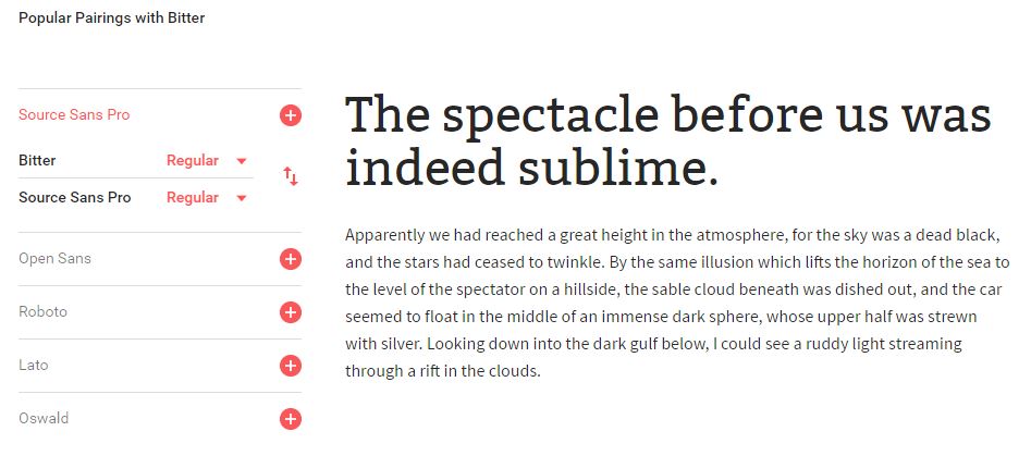
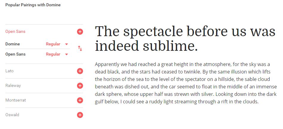
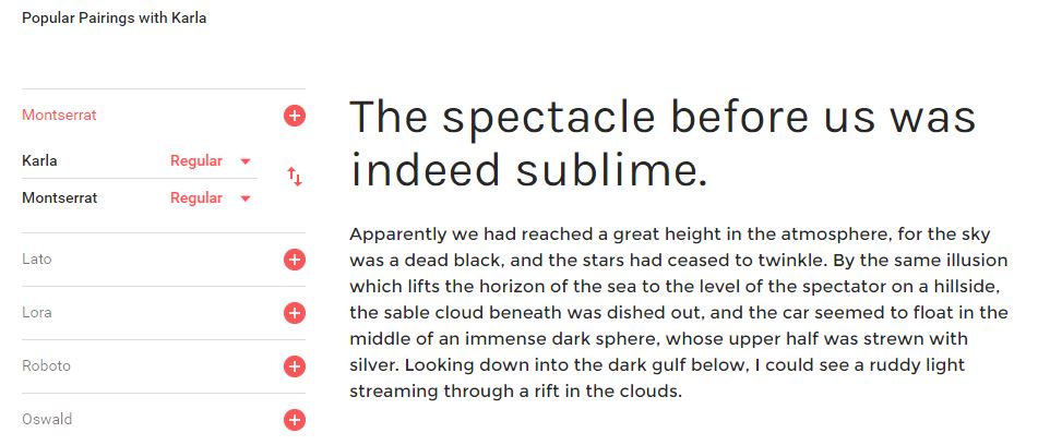
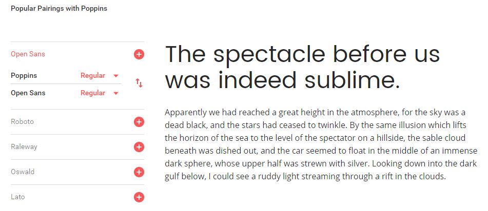
Finding the perfect font isn’t always easy. We want to help you provide your site visitors with an awesome user experience. That’s why we compiled a top 10 list of web fonts developed by reputable type designers, all of which are available for free via Google Fonts.

Can you figure out the typography we use on Z Coast? Take a guess in the comments section, it’ll be fun.

Anyway, on to the good stuff!

*Note: We’re intentionally not including single-weight fonts because their usefulness is limited in good, real-world design.

It’s cool, you can thank us later.

Give Your Website Character With The Right Web Font

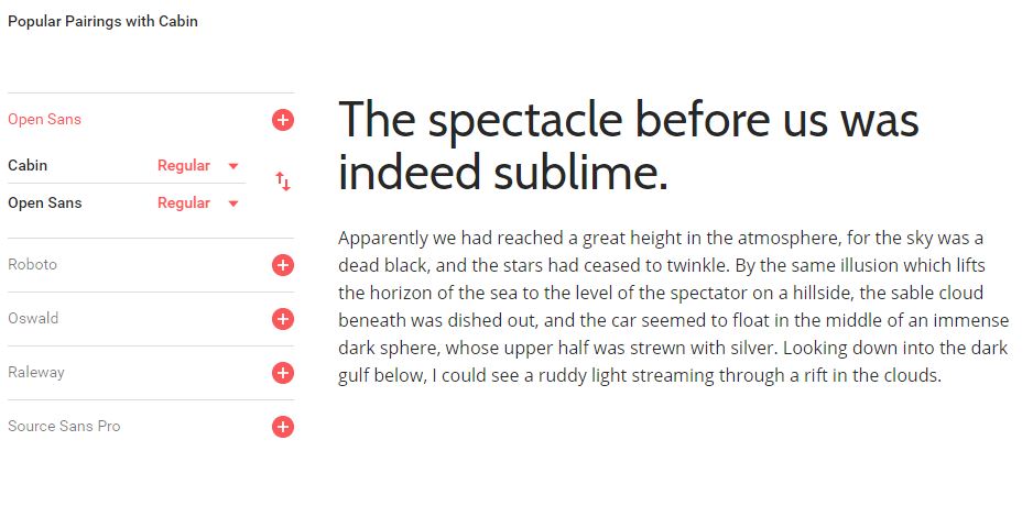
  1. Cabin


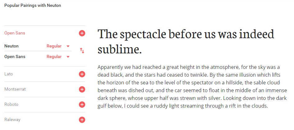
  2. Neuton


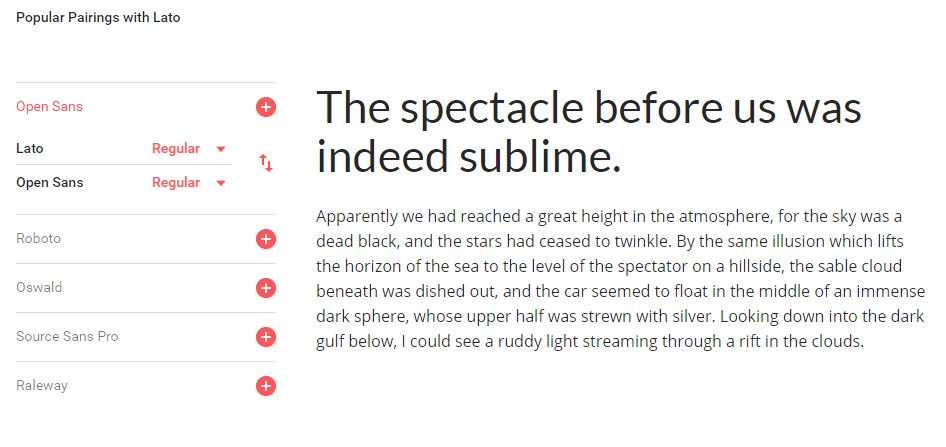
  3. Lato – Personal Fave. Just saying.


  4. Bitter

  5. Domine

  6. Karla

  7. Poppins

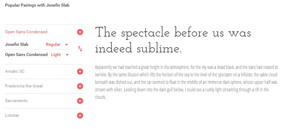
  8. Josefin Slab

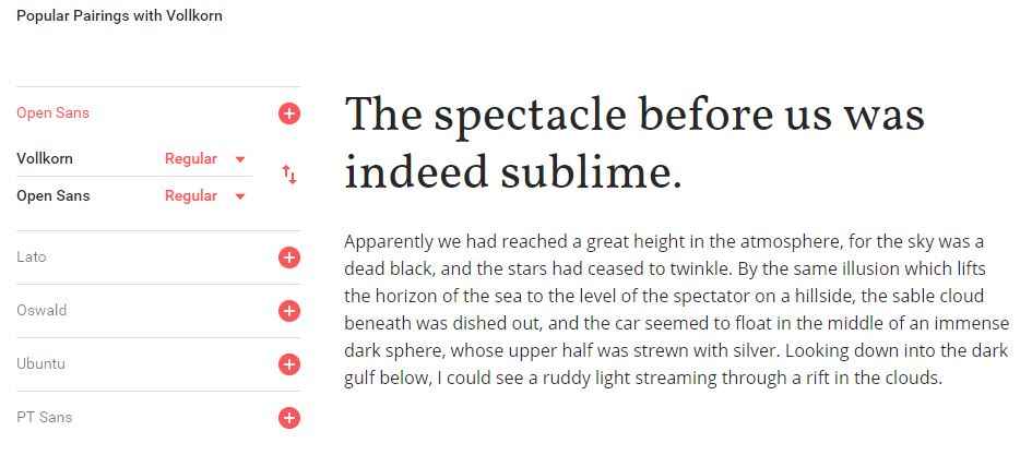
  9. Vollkorn

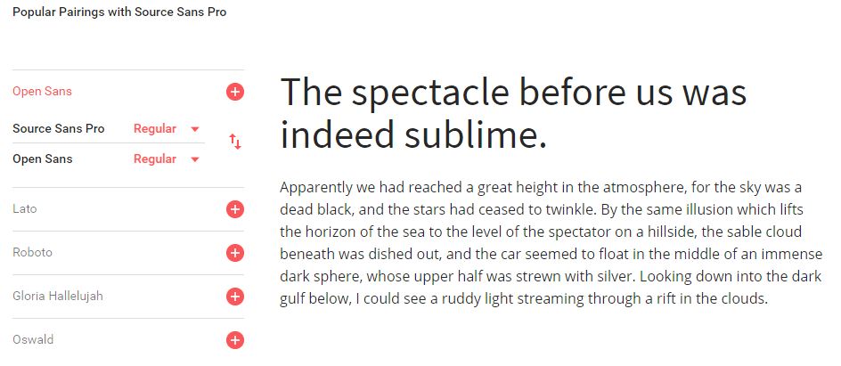
  10. Source Sans Pro


Remember, when setting the typography for your website you don’t have to limit yourself to a single web font.  It’s okay to use more than one (as long as you don’t overdo it).

If you want some tips on choosing and combining web fonts for your website, we recommend checking out The Definitive Guide to Free Font’s by Typewolf or shooting us a message if you have any questions about typography. Or both.

Web design is constantly evolving. Every year new trends are born. Some stick around for the long haul and others fade quickly. It’s just how the design world works.

But it’s all of these things together—the genius design trends that stick and the ones that suck and fade—that make up the face of the internet as we know it. It’s no big secret either that the majority of trends we see every year often come from giant web design companies.

However, good web design is influenced by more than just the big design agencies. Music, fashion, cultural events, news and more also play a big role in the design trends we see.

So the big question going into 2017 is: What are some of the most exciting new web design trends everyone’s anticipating in the new year? We’re glad you asked!

As designers, it’s our job to stay up-to-date on all the cool things happening with graphic and web design so we can create stunning websites for anyone who comes knocking. Let’s check out what to keep an eye on in 2017 so we can keep websites looking fresh all year long.

Visually Interesting Trends You Can Expect in 2017

  1. Better & Brighter Colors
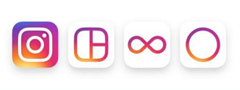
  2. As movements like minimalism grew insanely popular in 2016, web designers had to find creative ways to infuse personality into their designs while working within the stripped-down aesthetics we’ve all come to know and love.And in several cases, bright and bold colors became the solution. While it’s *not technically* a website, look at Instagram’s app icon redesign:

     (Source: Instagram Blog)

    As you can see, it’s not just about bright, bold colors. Gradients are here in a big way and expected to have an impact on websites in 2017 in a big way.

    Instagram did a great job blending and blurring those exhilarating hues into something reminiscent of a soft summer sunset. Better and brighter colors are something everyone should be looking forward to in the upcoming year.

  3. Hand Drawn Iconography
  4. Speaking of icons, hand drawn icons in web design are something else to keep your eye on next year. Hand drawn icons help web designers create websites with contrasting elements that keep users engaged with your site. Epic’s website, for example, embraces a lot of creative things: funny hand-drawn characters, flat-style landscapes, a little grunge and amazing typography.

    We don’t know how many sites like Epic you’ll see popping up in 2017 but we expect to see a lot more hand drawn elements regardless. We’ve already begun to see a trend towards using hand drawn icons with CTAs in a joint effort between marketers and designers to increase conversion rates.

    Think it’s a trend that will stick? Tell us about it in the comments. Moving on to number three on the list…

  5. GIFs
  6. GIFs in web design are expected to be big in 2017 but let’s get one thing straight first: don’t abuse them or you’ll hurt the UI experience of your website. If you want to try using GIFs (and animations) in your web designs throughout 2017, do it right. You can use GIFs to accent important aspects of your website and bring it to life. When used appropriately, they give an almost sophisticated touch to sites and demonstrate a deep understanding of web design and how it works.

    One Design Company makes nice use of subtle animations on the homepage to welcome visitors and make their site stand out from the competition.  So remember, when we’re talking about GIFs and animations here, we’re not always referring to the images you find on GIPHY.

  7. Overlapping Guidelines
  8. Overlapping guidelines really started to catch on with the introduction of Google’s Material Design Guidelines. The trend is popular, effective, and expected to carry over and shine in 2017.

    So far, it’s been found to be most effective using contrasting colors and large shadows. This results in a subtle but high impact that produces a satisfying transition between elements as visitors scroll down a page.

  9. Big, Bold Typography
  10. Yes, big typography has been trending for some time now but web designers like a creative challenge and making big, bold statements. Typography rules used to be very strict but that isn’t the case anymore.The design world has come to an agreement that content deserves our focus and that’s why you’ll be seeing more and more websites feature lines of inspiring copy set in type that’s just as big and bold as the design of the website itself.

    Big and bold doesn’t always have to refer to the weight of a font though. It can also refer to the amount of real estate given to display the copy. In a world that’s as fast and overloaded as ours, concise and powerful statements will become the fuel that good websites run on in 2017.

  11. Focus on designing for personalization & conversion
  12. Personalization of content has been a hot topic all year long, but no one seems to have the winning answer yet regarding how to do it “right” every time. Essentially, the goal is to provide the right content at the right time to the right person based on things like:-Demographics: Who’s the visitor?

    -Behavior: What’s the visitor doing?

    -Context: What device is the visitor using and how did they get here? Webflow made an interesting observation earlier this year regarding personalization stating, “We’ve seen some interesting experiments in this direction across the web, many of which revolve around a manual personalization of content recommendations by the user, recommendation of ‘related’ reads, and some algorithmic solutions more akin to what Facebook is capable of doing.”

    All you can do is not be afraid to try new things in an effort to find what works best for your business and the people coming to your website. It’s called personalization for a reason.

  13. Get ready to see more SVGs
  14. Scalable Vector Graphics (SVGs) present web designers with a lot of advantages over traditional image formats like JPGs and PNGs. Instead of being pixel based, SVGs are composed of vectors.Since SVGs are vector based they are resolution-independent and look good on any screen and any device. Plus, you can animate them! So keep that in mind as you move forward in the new year.

Happy Holidays from the Z Coast Media team! Thanks so much for reading the blog. We’ll be taking next week off to recharge and spend time with our families but we’ll be back in 2017 with some exciting new things and brilliant web designs.

See ya then!

I was following a #bufferchat on Twitter earlier this month about idea generation and it got me thinking about my own idea generation process, where we go for creative inspiration, and why it’s important to free ourselves from the mundane thoughts that hog our brain space the majority of the time.

Side note: If you’re not familiar with #bufferchat you really should get involved. Buffer hosts weekly “chats” on Twitter that center around specific topics and anybody can participate in the discussion. It’s pretty cool.  

As creative entrepreneur’s, we’re always on the lookout for inspiration. Ideas themselves come and go pretty frequently but you can’t ever predict when something will inspire a great idea.

We read books and blogs, watch movies, listen to podcasts, and follow YouTube playlists hoping something will spark the flame of creativity when we’re stuck because generating ideas on demand isn’t always easy. And that’s why I loved the idea generation topic on #bufferchat a couple of weeks ago.

The whole point of the chat was to share ideas, inspirational resources and encourage fellow creatives on their innovative idea journey. The whole chat inspired this post and gave us the idea to share the 14 most amazing idea generation techniques and resources we could put together. Thanks, Buffer!


use-these-7-techniques-to-jumpstart-your-creativity

Use These 7 Techniques to Jumpstart Your Creativity

We hope these tips spark some innovative ideas for you no matter what you’re working on today.

  • Brainstorming. I know, I know, this isn’t anything you haven’t heard before but it’s a tried and true method for inspiring new ideas. The point of brainstorming is so people can speak freely about their ideas. There’s no assessing anything so there’s no fear of criticism when sharing thoughts. Even the weird ones. Taming your thoughts is a lot easier than expanding your mind.

    Next time you’re stuck, get together with at least one other person and bounce ideas off of each other. When you’re brainstorming, 1+1=3 so you’re allowed to think outside of the box.
  • SCAMPER. This one is a personal favorite because SCAMPER is an idea generation technique that uses action verbs to stimulate your imagination. It’s a technique that was developed by Bob Eberie.

    SCAMPER is also an acronym. Each letter stands for an action verb which in turn serves as a prompt for creative ideas:

    S – Substitute
    C – Combine
    A – Adapt
    M -Modify
    P – Put to another use
    E – Eliminate
    R – Reverse
  • Storyboarding. Storyboarding is fun! If you’ve never created a storyboard before you should try it. When you storyboard, you develop a visual story to explain and explore ideas. Storyboards are especially helpful when you need to represent information you gathered while researching a topic.

    To create a storyboard all you need is a whiteboard or corkboard, whichever you prefer. Pictures, quotes, and other pertinent information is useful as well because that’s what you use to stand for scenarios and assist with comprehending the relationships between all of your ideas.
  • Attribute Listing. Attribute listing is more of an analytical approach used to recognize new forms of a product or system and identify areas that need improvement. Basically, you break something completely down, like a blog post, for example, note all of the different directions it could take, and see whether any change or combination to the topic idea would improve it or make it a complete flop.
  • Visualization. Visualization is an idea generation technique that gets you to think about challenges visually in an effort to better comprehend them. Nick does this all the time so we promise that it works.

    Picture prompts are particularly helpful when you’re using the visualization technique to solve a problem. Drawing things out or looking up literal pictures help your brain establish connections as well as surface emotions, feelings, and intuitions.

    Bryan Mattimore suggests that you use images that are visually interesting, portray a multiplicity of subject matter, and depict people in varied kinds of relationships and interactions. It also helps to tailor the photos to the character of the problem you’re trying to solve.
  • Daydreaming. Seriously. Let your mind wander from time to time. Daydreaming is a great way to trigger innovative ideas. Just keep a notebook nearby or download an app like Keep or Evernote so you can quickly jot down ideas when they come to you.
  • Brainwriting. Similar to brainstorming, brainwriting is an idea generation technique that has you set a timer (like 5 minutes) and jot down as many ideas, thoughts, or questions relative to your perplexing topic. This particular technique works best with a group of 3+ people.

    After time’s up, everybody passes their paper to the person on their right (or however you choose to do it) and then you add more ideas to the list you received. Once everybody in your group has added on to everyone else’s ideas, collect the sheets and open up discussion in the group.

    It’s almost impossible not to generate some creative ideas to act on when using this technique.


7-websites-for-creative-inspiration

7 Websites for Creative Inspiration

The techniques above are great for generating ideas with a team but sometimes you  just need some personal creative inspiration. We don’t want to make this list obnoxiously long so we’ll just share 7 of our go to places when we need some creative inspiration:  

  1. Creative Bloq. Creative Bloq is full of fresh thinking, expert tips, and tutorials guaranteed to help flex your creative muscles. They’re great at providing creative inspiration for creative people.
  2. SitePoint. Well-known among web designers and developers, SitePoint is the perfect place to learn things like HTML, CSS, JavaScript, PHP and more. The community is rich and engaging too, so you’re bound to stumble upon some words of inspiration every time you visit.
  3. JUST Creative. Technically, JUST Creative is the design portfolio of Jacob Cass but it’s also a pretty inspiring blog to keep up with. Cass specializes in logo design and brand identity so his posts are always full of inspiring info about topics like typography, SEO and web design, and storytelling techniques to name a few.
  4. Red Lemon Club. Red Lemon Club was founded in 2009 by Alex Mathers. It’s a great website that regularly showcases tips about branding, productivity, and business and it’s a great resource when you’re stuck on a project.
  5. Awwwards. If you’re ever in need of a little design inspiration, go to Awwwards. Awwwards is an organization that recognizes and promotes the talents of the best web designers, web developers, and web design agencies around the world.
  6. Speckyboy. Speckyboy is an online magazine for web designers. The mag focuses on exploring new techniques for inspiration and highlights a lot of cool and interesting resources for you to use.
  7. Ultralinx. They’re one of the best online magazines out there. Ultralinx covers high-quality tech, art, design, gadgets, and photography. At the time of this post, Ultralinx is my favorite go-to inspirational resource and they’ll probably stay that way for a long time. Highly recommended.


What are some of your favorite idea generation techniques or go-to resources? Let’s inspire each other and talk about them in the comments!


It doesn’t take more than a quick Google search to find a web designer nowadays. The internet is a big marketing tool that more and more companies are investing in. And don’t even get us started on social media.

So if you’re web designer in a Google search filled sea of other web designers, what can you do to set yourself apart? In our opinion, it all starts with having the right web design tools.

Since web design is  Nick’s  area of expertise, he agreed to share his 7 must have tools for getting the job done right (and make your job as a designer easier). Check ‘em out:


7-inspiring-web-design-tools-photoshop-2

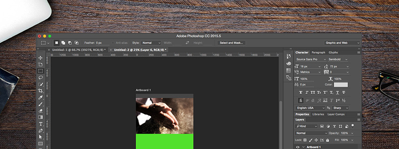
Adobe Photoshop CC

Adobe Photoshop CC is the ultimate web design tool and it’s one of the most iconic pieces of software known to man for a reason: it blows the competition out of the water when it comes to manipulating digital images.

Photoshop CC also garners praise as one of the best web design tools out there because it’s really a whole bunch of tools in one. The software boasts features like:

  • Content-aware editing
  • 3D design capabilities
  • Synced libraries
  • Complimentary mobile apps

And so much more. Not to mention Adobe is constantly working to make the interface more customizable. Whether you’re a web designer with decades of experience or you’re just starting out this a must have web design tool period.


7-inspiring-web-design-tools-google-fonts

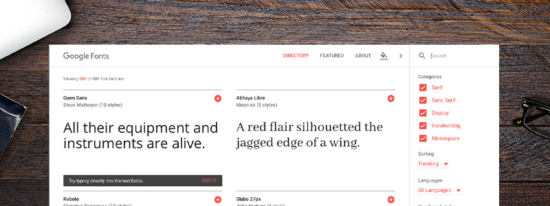
Google Fonts

It’s been six years since Google Fonts was unveiled as one of the world’s largest, free web font services. Google Fonts is easy to use, boasts impressive visuals on its own, and it’s completely mobile responsive so you can play with fonts on the go.

Additionally, Google Fonts also come with a custom color chooser that allows you to preview how your font looks across a swatch of colors. There’s no doubt about it: Google Fonts is a must have web design tool and deserves a spot in your handy dandy designer’s toolbox.

Google Fonts doesn’t cost anything either so, not only is it a must have web design tool, it’s one of the best free web design tools available. If you’ve never used Google Fonts before, this article from Sitepoint provides a comprehensive overview that covers what makes Google Fonts so awesome and why you should be using it.


7-inspiring-web-design-tools-coffee

Coffee

Ask any creative, web designer or not, what their drink of choice is and we’re willing to bet that 9 times out of 10 the answer you get is coffee. It’s a proven fact that coffee gives you more energy and a stronger ability to focus.

Coffee is a great tool for helping you execute those creative ideas you have and showing the world what a great designer you are. It’s also one of the cheapest web design tools you can get your hands on.


7-inspiring-web-design-tools-illustrator

Adobe Illustrator CC

Surprise! Another Adobe product. It shouldn’t really be a surprise, though. Adobe Illustrator CC is the king of vector drawing tools after all. The handy Live Shapes feature and the Pen tool makes this software insanely easy to use and a must-have for any web designer.

Illustrator also comes with a  useful export feature that allows web designers to export elements and art boards to common web-based formats like JPEGs and SVGs. You can export by various scales and export your art boards and assets too.

For more in-depth coverage of how this works, we recommend watching this Illustrator CC video from Adobe.


7-inspiring-web-design-tools-music

Good Music

No web designer’s workstation is complete without some inspirational music playing in the background. Some good music can go a long way when you’re designing. And thanks to platforms like YouTube and Spotify, you could say music is one of the best free web design tools available if you use it right.

Our playlists at Z Coast change up pretty often but if we had to make one recommendation for you to add to your own playlist this week we’d suggest this Willy Wonka – Pure Imagination (Trap Remix). You’re welcome.


7-inspiring-web-design-tools-color

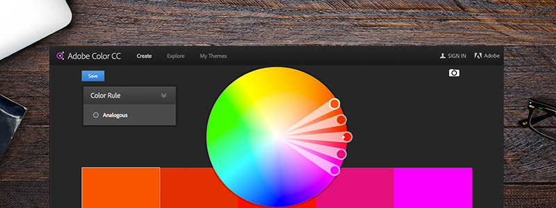
Adobe Color CC

At this point it’s pretty obvious Nick has a serious love affair happening with Adobe but he’s the web designer here and he insists this is a must have web design tool so listen up.

Adobe Color CC is like the ultimate paint swatch for your web apps. There are 1000s of colors to browse with Adobe Color CC making it the go-to tool for finding the perfect color combos for your designs.

The site itself is inspiring and will even offer suggestions when you need them. There goes your excuse for being stuck!


7-inspiring-web-design-tools-design-spiration

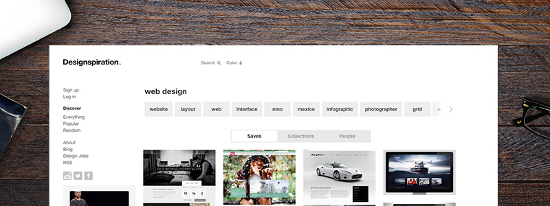
Designspiration

It kind of speaks for itself doesn’t it? Designspiration’s sole purpose of existence is to be a resource that helps you discover and share great design’s. This web design tool is “focused on maintaining a high level of great design inspiration to share around the world.”

Go check it out. Use it. Design brilliant things.


Did we forget something? What are some of your must-have web design tools? Tell us in the comments below and we might update this post and include them!


WordPress plugins provide all kinds of customization options for site admins but there’s 46,635 plugins to choose from in the WordPress directory so where the heck are you supposed to start?

Even if you narrow it down to the “best WordPress plugins,” knowing which of the best plugins for WordPress you should start with can still be a daunting task. So, from the goodness of our hearts, we decided to take on this daunting task for you and breakdown 5 important WordPress plugins we believe are essential to any new (or existing) website. Basically, we made a shortlist to help you get started. You’re welcome.

We have personal experience using and testing all of the plugins for WordPress on this list so if you any questions at the end feel free to shoot us a message. Let’s get started!


All In One SEO

Nine times out of ten, when you go Googling for the best SEO plugin for WordPress available, you’re going to get 1 of 2 results: Yoast or All In One SEO. Both plugins have “fans” who will argue with a brick wall about why the other is better and both have good reason to make that argument.

But at Z Coast Media, we prefer the All In One SEO plugin over Yoast. Here’s why:

All In One SEO does exactly as promised: it helps you create a website that is search engine friendly so that you can focus on creating a website that’s visitor friendly.

It’s a powerful plugin that comes with an abundance of features and settings including the ability to add your Google Analytics ID for easy Google Analytics setup, a meta box below the post editor for all content types (posts, pages, or custom post types) with additional advanced options for setting canonical URLs and noindex tags, and an XML sitemap (something Yoast doesn’t offer).

Additionally, All In One SEO comes with a lot of great support because there’s so much extensive documentation about the plugin on the web. We recommend giving this user’s guide a read when you start using the plugin. All In One SEO is super easy to use, but the guide will help you make the most of everything the this SEO plugin has to offer.


Analytify

Blog traffic stats are an important thing to be aware of. Everybody knows that Google Analytics (GA)  is the best free platform out there for measuring those kinds of numbers and we definitely recommend setting up a Google Analytics account and installing the tracking code on your WordPress site.

Analytify is a WordPress plugin that we just recently started using. This plugin allows you to check your GA stats right there at home in your WordPress dashboard. But the the thing that granted Analytify a spot on this list is the fact that it also lets you check stats by individual page and post. You get stats in the front panel too.

Oh, and the best part about this nifty little plugin? It’s totally free! You download, get your authentication code and then you’re up and running in just a matter of minutes. Analytify is a great analytics plugin that helps users understand what is and isn’t drawing visitors to your site and adjust accordingly.


WP Smush

Site speed is crucial to your visitor’s user experience (UX). It’s so important that slow loading websites cost retailers $2.6 billion in lost sales every year (for more cool facts about what impacts the UX/UI of your site check out this  infographic).

One tip for improving your site speed is optimizing image size. It’s effective, easy, and often has dramatic results. Image files tend to be packed with unnecessary data so they can often be compressed without impacting the visual quality of the image.

Using the free version of WP Smush, you just download the plugin and then it gives you the option to optimize your images when they’re uploaded. It’s a simple plugin. But you don’t always need something fancy and expensive to get the job done and that’s what’s important. WP Smush gets the job done.

However, you do have the option to upgrade to a pro version that gives you several additional features such as the ability to optimize images in bulk. Which version you need really depends on the type of WordPress site you plan to have and if there are a lot of (big) images you plan to upload over the course of its existence.


Gravity Forms

There’s a lot of form plugins out there for WordPress so why would you pay for a premium forms plugin like Gravity Forms? Because Gravity Forms gives you so much more than your average contact form. Duh.

With Gravity Forms, you can accept payments through PayPal, integrate payment forms with accounting providers, customize registration forms to gather the specific information you need, and control how and when emails are sent once forms have been submitted.

You don’t get a lot of those features with the freebie forms. It’s not much more difficult to use than the basic freebies but you can do a lot more cool things with Gravity Forms like add a CAPTCHA to weed out spam entries. You definitely get more bang for your buck.

Gravity Forms is an excellent plugin that will help you customize the forms on your site and gather the right information you need in order to provide your clients with the best services and products possible.  If you’re not sure if Gravity Forms is right for your new site though, you can always give their demo a whirl to help you make up your mind.


Mouseflow

We. Love. Mouseflow. If you don’t know what Mouseflow is you’re about to learn. Mouseflow is one of (if not the) most awesome website heat-mapping and analytics software available. Period.

In order to use the Mouseflow plugin you first have to pick and sign up for a Mouseflow plan. They offer several options from Free to $299 per month. All of them offer an abundance of features so you can’t go wrong no matter where you start.

Once you’ve got your account setup you can download the Mouseflow plugin to your WordPress site and skip the hassle of having to login to multiple accounts to see your data. With the Mouseflow plugin, you can check your heatmaps and session replays from within your WordPress account.

Mouseflow provides you with a unique perspective regarding how visitors interact with and flow through your site. You’ll regret it if you don’t setup a Mouseflow account and start using this plugin because you’ll be missing out on a lot of crucial data you could have for  FREE.

Got Any Other Plugin Ideas For Me?

We’ve got some plugin suggestions for eCommerce WordPress sites too so you might see that post in in the near future. If you’d like to see it sooner than later, tell us in the comments below! And if you have any favorite WordPress plugins you think every website can benefit from, tell us about those in the comments too.