Posts

Name a day of the week and just about anybody can guarantee their email inbox is overflowing with messages.

We are all constantly bombarded with emails upon emails that do little for us besides giving us some boxes to tick as trash when mid-afternoon rolls around and the office is quiet. But…

Every now and then we get an email that’s so good not only do we read it, we share it with friends and tell them why they should subscribe, too. They’re top-notch and often breathe new life into our inboxes. For that, we are thankful.

What separates a top-notch marketing email from the rest of the pack?

Top notch email marketing campaigns are often

  • Cleverly written
  • Filled with interesting graphics
  • Personalized & responsive

They also tend to feature a meaningful and highly actionable call-to-action (CTA). If marketers are going to fill our inboxes with messages there better be a  point. Right?

Schedule some time with a specialist to learn how to build a successful email marketing strategy.

12 Examples of Excellent Email Marketing

We know you already get enough emails and it’s not easy deciding if you should subscribe to another list. However, if you’re feeling froggy, we’d love to show you some of our favorite email marketing examples just so you know they’re out there and can get in on the good stuff too.

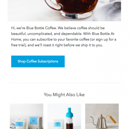
  1. Blue Bottle Coffee

    Blue Bottle Coffee is the bomb. They’re all about delivering the most delicious and sustainable coffees they can find right to your doorstep. And their emails never fail to deliver a delicious experience in your inbox.

    It’s a win-win.

  2. Charity Water

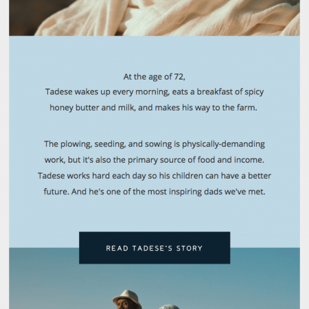
    Charity Water is a non-profit organization near and dear to Paige’s heart. For those of you unfamiliar with Charity Water, they’re  a non-profit whose mission is to bring clean and safe drinking water to people in need around the world.

    Their newsletters keep you in the loop regarding current projects and where your money is going if you’ve donated. They also have a knack for delighting subscribers with the occasional “profile feature” email as seen in the example below.

  3. Paperless Post

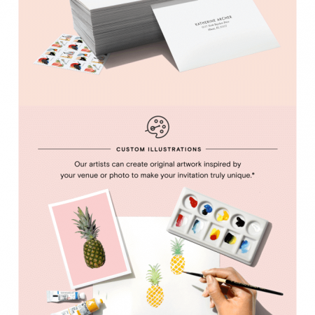
    “Paperless post helps you create online and paper stationery that reflects your individual aesthetic.” Their dedication the helping customers create distinct and custom designs that make it easy to communicate on any occasion consistently comes through in their emails.

    Any Paperless Post email we’ve ever received has been so easy to skim and so pretty to look at it’s ridiculous. Enjoy!

  4. Litmus

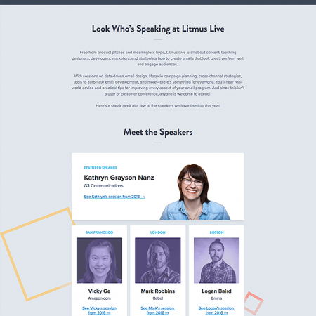
    “Litmus makes your email better.” Truth.

    Of course their own email marketing messages are going to be fantastic. The example below features a solid content hierarchy that looks great on desktop and mobile. As it should.


  5. Moo

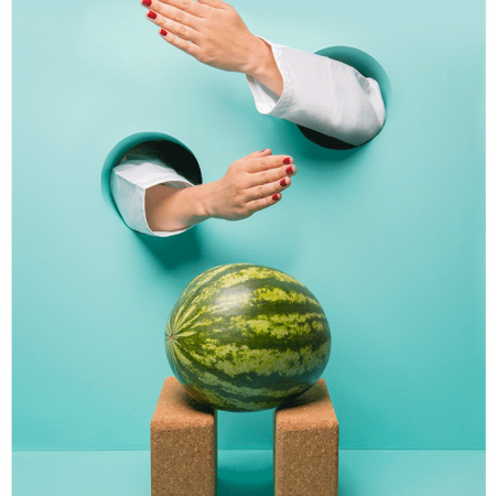
    We wouldn’t be surprised at all if you say you’ve heard us say it before but we’re total fangirls and fanguys of Moo and their newsletter (or any other email they send).

    Who can say that getting something called The Moosletter on a regular basis isn’t dope? No one. If you’re not subscribed you’re missing out.

  6. REI

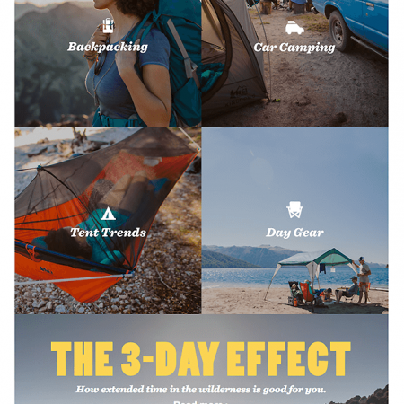
    Every time an REI email hits our inbox we’re ready to lace up our hiking boots and head out into the wild. So in short, they know exactly what they’re doing with their marketing. Respect, REI, respect.

    Everything about this email example is great. Icons, images, typography. Name any element of the email and it’s just great. We’re taking notes too.

  7. Huckberry

    Huckberry delivers some seriously cool gear and some seriously good deals. It’s one of those sites that you have to sign up for before entering but it’s totally worth it. Promise.

    We’ve been members for 2+ years now. We’d never recommend something without trying it ourselves first. The Huckberry newsletter (featured below) is amazing and often inspires us to lead more adventurous (and stylish) lives.

     
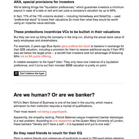
  8. The Hustle

    We only discovered The Hustle recently and my word how did we not know about this before? The copywriting is phenomenal and it’s a treat every day when the email hits our inboxes with all the tech and business news we need for the day.

    The Hustle is the best we’ve ever seen at writing personal, in your face copy that resonates with their audience. Plus, everything they write is just plain fun to read.

    Hat’s off to the copywriters here.

     
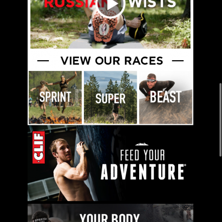
  9. Spartan Race

    If you’re never really sure what to do once you get to the gym or you’re just looking for a little motivation in your life, we highly recommend subscribing to the Spartan Race Workout of the Day email.

    If you’re looking to go to school in the art of writing copy and crafting CTAs that inspire people to get off their butts and change their lives, we highly recommend subscribing to the Spartan Race Workout of the Day Email.

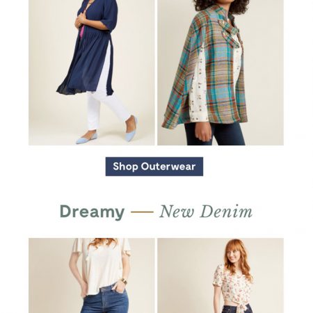
  10. Modcloth

    Modcloth does a phenomenal job with their CTAs. They’re easy to spot and easy to click whether you’re at your desk or on your phone. Their copy is always light and airy which is perfectly on brand. Love.

     
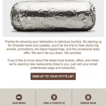
  11. Chipotle

    One: Chipotle’s emails are packed with just as much flavor as their burritos.

    Two: Chipotle’s subject lines never disappoint. The sub for the featured email below was: “The Best Tasting Email You’ll Receive.”

    Three: Sorry for making you hungry.

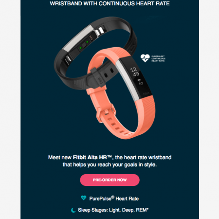
  12. Fitbit

    How to showcase a featured product via email?

    *enter Fitbit*

    This email is a prime example of how to do a product feature email. It’s also an excellent example of CTA basics:

    – compelling copy under 5 words
    – contrasting colors
    – clear message

These are just a few of our favorite emails. We could go on all day but nobody’s got time for that.

We will stick around long enough to say that these examples all have a resounding message though: Don’t just follow best practice when it comes to your emails. Throw in some personality too.

Sometimes we get so wrapped up in sticking to best practices that we forget how email best practices get to be best practices in the first place. In order for best practices to be established in email marketing, there must be email specialists out there who aren’t afraid to push boundaries and try new things.

Take notes from the examples above and try experimenting with your emails. Toss in a GIF every now and then like Moo or get a little saucy with your copy like The Hustle if it’s on brand and you think it’d work with your audience.

Have a question or just want to share some of your own favorite email marketing examples with us? Drop it in the comments. We’ll be like besties sharing secrets. But on the internet.

What’s the best day of the week to send emails?

We get this question a lot. The truth of the matter is, when you get down to the nitty gritty of it, it all depends on your audience.

Plenty of folks have done studies to give you a good starting point to run tests though that can help you determine if certain days of the week really do work better than others for your recipients.

For example, MailChimp, HubSpot, and GetResponse have conducted multiple studies over the years to discover that across all industries on average:

  • Tuesdays are the best days to send emails if you’re shooting for high open rates; Thursday comes in second
  • Tuesdays and Fridays are the best days to send emails if you’re shooting for a high click through rate (CTR)

The same deal applies to send times as well. It depends on who you’re emailing and where they’re located. However, if you don’t know where to start, we suggest you start testing the following times to find your sweet spot:

  • 12NN – 4:00PM if your goal is to achieve the most opens. Inbox traffic slows down in the afternoon so your recipients are more likely to see and open your email if you send it someone between Noon and 4 o’clock in the afternoon.
  • 6:00AM – 8:00AM if your goal is to up your CTR or get a response from your recipients. The best time to send an email that requires action is to send it when your recipient’s inbox isn’t seeing a lot of action. We also recommend testing out some evening times between 8:00PM and Midnight as well.

Again, we can’t stress enough that while these serve as a good general rule of thumb, best practice is to use analytics to determine the best email send days and times for your market.

How important is mobile really when it comes to email marketing?

Extremely. Exceptionally. Tremendously. Remarkably. Pick your adjective. If your emails aren’t mobile friendly, you’re missing out on a big chunk of your market.

In Litmus’ recently released State of Email Report [2017], it was revealed that:

  • More email is read on mobile than on desktop – 54%
  • Mobile unfriendliness is the leading cause of opt outs (5%) while 43% of consumers have marked email as spam due to mobile unfriendliness
  • 1 out of every 3 clicks within an email occurs on a mobile device

So what can you do to ensure that your emails are mobile friendly? Make them responsive!

Responsive email designs expand or contract the layout based on the device being used by the reader.

If a reader opens the email you sent on their laptop, the email will appear at its widest size. However, if a reader opens that same email on an iPhone or Android, the responsive layout will immediately shift to accommodate the smaller screen size without effective legibility of your content or graphics.

If you’d like to learn more about how responsive (and hybrid) email design works, we suggest you check out this article by Jason Rodriguez over at Litmus:

Understanding Responsive and Hybrid Email Design

Why Personalize Emails?

We’re glad you asked! Email personalization goes beyond just calling someone by their first name in your salutation. Surprisingly though, according to Kissmetrics, only 5% of companies take the time to personalize their emails beyond just including a first name.

Why do you think that is when 94% of companies say they know that personalization is critical to success? It seems the answer lies in the fact that 60% of marketers admit they struggle with personalizing content in real-time.

Personalizing emails is important because it makes your emails more relevant to your subscribers. When you personalize an email you’re appealing to the individual interests of your recipients.

Where can you start?

  • From Name – The From Name is one of the most prominently displayed elements of your campaign when it arrives in your subscriber’s inbox. It’s not surprising that 68% of Americans say they base their decision to open an email based on the From Name.
  • Subject Line –  This is the second most prominent element in the inbox. Make the most of it! Depending on the type of email you’re sending this is a great place to include the recipient’s name or location.
  • Email Copy – If you know your subscriber’s first name, t-shirt size, birthday, or any other information you can use to personalize the content of the email they’re receiving, use it!
  • Imagery – Personalizing your emails go well beyond text. Dynamically changing your images in your email marketing campaigns is a great way to better appeal to your subscribers and increase CTR.

If you take the time to invest in good quality email marketing by getting to know your audience and their habits, and provide them with personalized content in a personalized format, it’s going to pay off.

Like we mentioned in the infographic above, email marketing has a 3800% ROI, but 77% of all email ROI comes from well-segmented lists and personalized campaigns.


Today, we’re going to cover the basics of email marketing for restaurants. We’re already hungry and we haven’t even started cookin’ yet. Cookin’. Get it?

Let’s just skip the rest of the bad food jokes and get right to it. Bon Appétit.

Why Restaurants Should Invest in Email Marketing

As a restaurant owner, email marketing is one of the most powerful tools at your disposal. It’s also one of the fastest, easiest, and cheapest ways to reach people who want to hear from you. All you have to do is give people the option to sign up.

Think of it like the first ingredient of your email marketing recipe. A simple place to start? Your own website. Dedicate some digital real estate to a sign-up form for your mailing list.

The sooner you start collecting emails the better. Start with friends and family if you have to and encourage them to forward the emails they get from your restaurant to other people in their contacts. You never know what might happen.


Whats-the-Secret-Ingredient-to-Good-Email-Marketing

What’s the Secret Ingredient to Great Email Marketing?

Once you’ve got a list you can’t just let the people who have signed up for your emails sit there and go bad like milk left on the counter overnight. That’s never pleasant for anybody.

The secret ingredient to any awesome email marketing plan is the cadence at which you email your lists. You’ve got to find the right cadence for emailing your subscribers. Keep ‘em warm and keep ‘em happy.

If you’re not sure where to start, a good rule of thumb is to aim to email your list one to two times per month. Make sure you stay on brand by using your restaurant’s logos, graphics, and other images often and always proofread your messages before sending them out.

It’s also a good idea to remember to stay conversational and not get too promotional with your emails. Hospitality is about people right? Use your emails to connect with people and show them a little extra warmth; give them something else to relate to.

What’s On The Menu?

Okay, you’ve got your list and you know how often you want to email everyone who signed up but what should you send them? They obviously have great taste and you don’t want to disappoint them.

No worries! There’s no reason to overthink this. People signed up to get emails from your restaurant because they’re obviously big fans of your food so give the people what they want!

We’re talking:

  • Menu Items: Tell them about seasonal specials, specific dishes, and newly added items to your menu.
  • Press: You got a good review in the local newspaper? Atlanta Magazine? Don’t be afraid to share it with your subscribers!
  • Private Dining/Catering: If you offer these services, they go particularly well around holidays, graduation season, and summer vacation.
  • E-Commerce: Gift card giveaway anybody? Don’t be shy about promoting restaurant swag either. Nobody ever has enough t-shirts. Nobody.
  • Special Events: Think fundraisers and happy hours.
  • Seasonal Promos: There ain’t no shame in playing the seasonal promo game. Use Mother’s Day, Father’s Day, St. Patrick’s Day, National Doughnut Day, whatever to whet the appetites of your subscribers.

We’ll even be as bold to suggest sharing cooking tips and recipes (especially if your restaurant already has a blog where you publish stuff like this).

There are plenty of hungry college kids and even grown adults (like us) out there who would happily subscribe to a restaurant’s email newsletter if it meant it might save them from another night of frozen dinners.


Don’t Forget Images

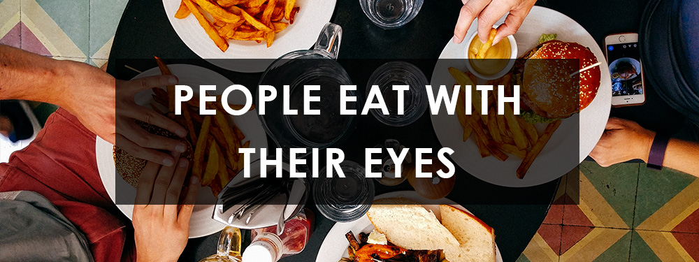
Once you’ve got the messaging down make sure you include some big beautiful photos in your emails. People eat with their eyes. Including quality images in your emails is important for every business who sends emails, not just restaurants.

Folks like photos. Wow them with close up shots of signature dishes, break down recipes, show off the best booth in the house. Get creative with it! But most importantly…

Follow the golden rule of email marketing and only send the people who have opted in to all the awesome emails your restaurant has to offer. It doesn’t matter how pretty your images are or how awesome that happy hour event is going to be, if they never wanted to see your email in the first place, it won’t do your restaurant a bit of good.

And there you have it! Cooking up an awesome email campaign to help get the word out about your restaurant isn’t hard at all. Try it out for yourself and let us know how email marketing is going for your restaurant in the comments below.

–Z Coast Team

If you check your email regularly, you’ve probably noticed emojis showing up in the subject lines of the email you receive more frequently. Why do you suppose that is?

Fun fact: 92% of the online population use emojis to help them more accurately express their thoughts and to make it easier for people to understand them. Emojis help us create personal relationships and engage with each other on a more emotional level.

Emojis come with some 💣 benefits

According to a report by Experian, 56% of brands that use emojis in their subject lines saw a 45% increase in their open rates. If that’s not motivation to try using a 😊 or two the next time you send out an email campaign we don’t know what is.

Not only do emojis have a positive effect on your open rates but they’re great space saving tools as well. And every email marketer knows space is at a premium when it comes to your subject lines.

This is especially true when you’re attempting to craft a mobile friendly subject line where you only have about 30-40 characters to work with. Emojis help email marketers say a lot with a significantly small amount of space.

Speaking of space, inboxes are crowded and emojis are excellent resources for helping you stand out. Check out these two (example) subject lines:

Falcons Fans – Gameday Grub Specials

Tailgate the right way 🍗 🙌 🍺

Which one was your eye drawn to? The one with the emojis right?

🤔 Which emojis should you use in your subject lines?

Which emojis you use in your subject lines really comes down to your audience. Even though the majority of people are pleased to see emojis in the subject lines of the emails they receive, you have to use them wisely.

You should only use emojis when they make sense, when it’s logical to do so, and when they can be used to support your message.

MailChimp tells us that 31% of email marketers using emojis utilize more than one in their subject lines. Emojis add a playful touch to most of the email subject lines that utilize them but it’s important to remember not to overload your messages unless you want your recipients to get bored.

If you want to use emojis successfully in your subject line, MailChimp also suggests the following:

  • Use emojis from the same category together (smileys, food, activities, etc.)
  • Take advantage of 😎, he’s pretty popular
  • Learn which emojis connect small groups together. For example, ✈️can be used to connect earth, travel, and transportation

Don’t forget: it’s okay to be creative! As email marketers, emojis give us creative freedom. Make the most of it.

Popular emojis you can test in your next subject line 😉

Before you start using emojis regularly in your subject lines you should try running some A/B tests first. In your test, send one group of recipients an email with your subject line + an emoji and send another group the same email without the emoji.

Do this a couple of times and analyze your open rates. This should give you a good indication of whether or not your audience engages well with emojis.

Ready to get started? Here are 15 of the most popular emojis to appear in subject lines: 😃 😍 😉 😎 👍 💪 👏 ☀️ ❤️ 🔥 🎁 ✈️ ⭐ ™️ 💨

What are some of your favorite emojis? Leave them for us in the comments!